Gray Windows 11 Folders done 
News!
Almost finished making the Windows 11 style folders and it's going to look amazing. I need to find some more logos and soon I'll be sharing the result with you.
@jokuihmemies Some I'm going to redo to make it better displayed in the folder... It's something easy to make the icons, the complicated thing is the logos
@jokuihmemies I am going to pack the base file to start the creation of two new ones. I need to know which new studios are missing or what they need to have their logo updated
@jokuihmemies Well, I already have some Windows 11-style ones that I use on my external hard drive.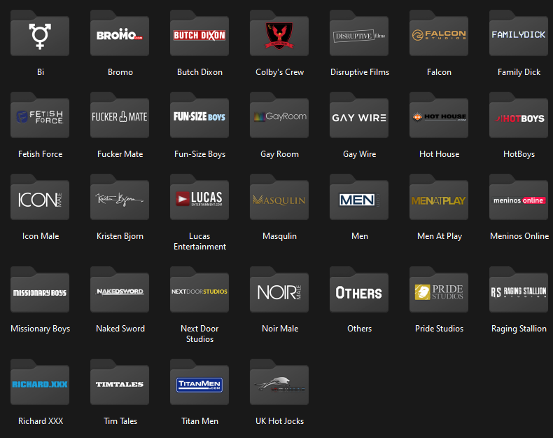
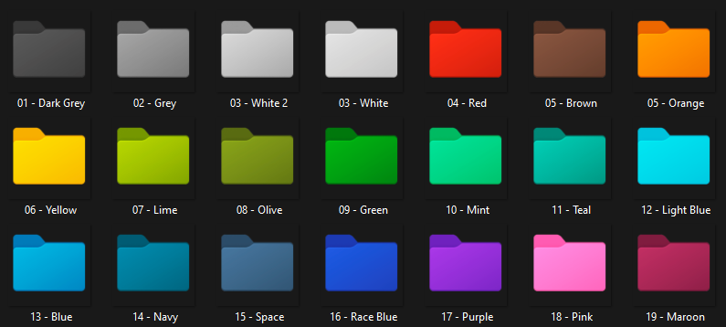
@jokuihmemies I have plans to resume creating icons and make them in the W11 designe. What would be the best color to use in folders?
@seXyatniGht Hey!
Tell me which studios you need and I'll create the icon for you
Hey!
You may be downloading the .png files and converting to the required format for use on MAC
@sexyatnight said in Custom Icons Folder:
@suitandtiex This is great, thank you!
@yoop said in Custom Icons Folder:
Great job!
Let me know if you need any icon specific, ok?
Custom Icons Folder
Hi!
I'm reposting custom icons for studio-based folders.
I ended up deciding to change the hosting location because it contains more capacity and as I couldn't edit the previous post, I'm creating a new one.
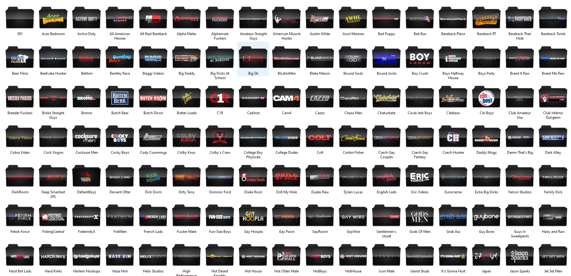
I currently have more than 200 icons created and I'm providing them in .ico (Windows), .png (can be downloaded and converted to any other format) and in .psd (photoshop file for editing).
If you want any specific icon, let me know. I'll create it so you can organize your videos.
Link: https://mega.nz/folder/uUEBTKxQ#bgrHHbve1n3c7Q00JY6MEw
Preview:
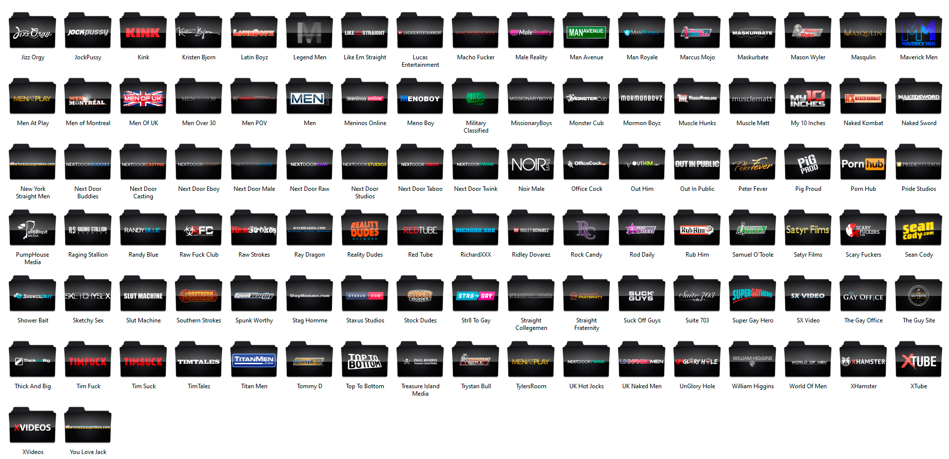
Enjoy
Ok
Here are the text only icons with an underline of color as would look on smartphones.I would say the underline of colour needs to be fatter to be able to be seen. Especially on phones.
It looks as if one could use smaller hieght tiles but the square tile is better to touck on on phones.
NOTE
The off center of the list is how it is displaying at present.
I would say centering them would look better.Also note:
Category icon tile size in this category list appears at 60 x 60 pixels
I particularly liked their result with the transparent background and I agree when you say that underlining needs to be fatter. I think that if you make the underline a little fatter and without any color degradation effect, it should be much better.
As for the colors, I found the colors very vivid, very prominent, looking at them on a website where the background is predominantly dark, it doesn't look very nice.
I was thinking and if we were to consider the hypothesis of the categories being represented only by text, we could do it as follows:
Starting from the idea that this is a gay site and the LGBT flag has 6 colors, which are: Red, orange, yellow, green, blue and violet.
We could create 6 Main Categories: Physical, Age, Entertainment, Ethnicity, Sex and Fetish, for example. Each Main Category would be represented by one of the colors mentioned above.
After defining which color would represent each category, we would transform the existing categories into subcategories and distribute them among the main ones:
Physical: Hunks, Bear, Twinks …
Age: Mature, Old and Gray, Youngblood ...
Entertainment: TV, Books, Magazine, Comic, Games ...
Ethnicities: Asian, Latino, Black ...
Sex: Anal, Bareback, Oral, Orgy, Solo, Straight ...
Fetish: Uniforms, BDSM ...
The icon would be very discreet: It would have a transparent background, the name of the subcategory with a font in white and an underline of the color defined for the category. I put some models that I made attached, but it's just the basics, it would be interesting to define a cool font later.
And there is also the possibility to rename, unify and create new categories as mentioned earlier, to be able to better represent or cover more things with a single category


while those icons still under discussion, can i kindly ask the author to create SVG images ?
If we use this very Modern Vector Format we can scale those images to all sizes without having any quality loss.Could you please check this one here: https://www.gaytorrent.ru/2.0/gtlogo.svg
this is already SVG
What font did you use? It would be interesting to use the same font in the images of the categories
Less in a icon becomes more of a caricature.
For races might be best to just have text.
map seems to work at small scales
Especialy if some color is added.Now does Latino include USA or not?
I agree with you, I believe that ethnicities should be represented only by words.
I have a few suggestions:
Could you make the icon for Black and Asian in the style of Latino and Middle Eastern? Showing some of the shirt, I mean.
And the Mature seems to have a slightly deformed head, not well rounded …
Could you try to make these adjustments ??
Can only attach 10 at a time…
Congratulations on your icons! I really liked him.
I think the only difficulty with the icons would be to represent the ethnicities
If using text only then could also use diagonal of square to increase size of text..
Also could match font style to categor
Here using a military stencil font.
Also can have background to match category (Could use gay handkerchief color code)
But not so good when in small icon size…
I did the test with a background image and saw that it wouldn't work very well on small images, so I thought of something that would look good:
The image of the main category would have 80x80 and the images of the subcaterogies would have 80x40 and would be aligned below the main.
Attached an example in which I just left different colors to illustrate, but it can be all the same color or whatever.


The Search Page is getting much better and I loved the icons that show / hide the images and descriptions but there are some things that need to be improved:
Attached is a preview of how it is and how it could look.
PS: I couldn't align the description text in photoshop so I got as close to the justified as I could.


Keeping in mind that these icons will be small, the “less is more” trope is even more important. I really liked the “Bareback” icon you designed; it’s simple, to the point, and easy to see at a glance. Different colors ought to be used for each, but there’s no need to link any color with a specific category. I mean, I get maybe using black for BDSM (or maybe Fetish) but what is the color of Themed Movies or Oral Sex?
I do think some of the more vague and/or severely underused categories should be merged eventually. Some of the examples already given (grey/older and mature, Homemade and Amateur, etc) are spot-on. Towards this I really like the new Fansite category - because most of those sites are pay sites, the performers are earning money, and many of them are already professionals in the wider porn industry.
I’ve always had a little difficulty with the “Anal” category. I assume most people to understand that Anal refers to fucking and does NOT include fingering, rimming, or fisting as the main event. Given that we have a Bareback category, I would like to suggest changing Anal to something along the lines of “Condoms” or “Safe Sex,” which is how I already think about the Anal designation. Let’s face it; all bareback sex IS anal sex but if we’re going to distinguish it from non-bareback fucking, what are we left with? Safe sex/fucking using condoms.
The discussion around using “White” and/or “Caucasian” is interesting given what’s going on right now, and also very delicate and tricky. Be very careful that this thread doesn’t blow up. It taps into the definitions of race and culture. To give a personal example: my mom was Mexican American but I look very WASP (White Anglo-Saxon Protestant - it’s a term often used in the US) and culturally I grew up in mainstream American culture. I have cousins who look as “white” as me (also some who are a lot darker), but grew up/live in Mexico and are CULTURALLY Latino. But I have never thought of any of them - light or dark - as a different race from myself. For me, the difference has always been cultural. To further the example, most Argentinians look European, because the indigenous people were basically wiped out and there was little to no mixing with the remnants (as opposed to, say, Mexico or Bolivia). Are the Argentinians “white” or Latino? And Brazil - Brazilians are very different from the rest of Latin America, and many consider themselves separate. Are they Latinos?
My comments above are only my own experience. I’m not claiming to be right, or an authority, or that other people’s perspectives’ aren’t valid.
I bring this up only to remind everyone that such classifications are difficult to make in the real world and here we are trying to come up with a system that works for porn.
I personally feel that we don’t have to have a category for “white/Caucasian” and this is why: It IS TRUE, as a previous commentator pointed out, that white is the default in porn, to which I might add that this is unfortunately true outside porn as well. Generally speaking, this is a bad thing, and we should all try to examine our own outlook on such things. But the point of these icons is to help users make quick decisions about what they want to see. Good or bad (personally I think bad, but that’s only my feeling) we all know that the majority of any particular movies we download are going to feature white guys as part of the cast. And a huge chunk of movies with white cast members are going to be all white. Therefore if you want to watch two white guys fuck, it’s already very easy to find; just hit the Search button. For this same reason I would say it would be pointless to have a “Gay” category; the vast, vast majority of films on this site feature all-gay action, and for those of us who like the idea of straight guys doing gay stuff, or a little female in the mix, we can easily look that category up.
Again, let me emphasize that in my belief, “white/Caucasian” as the default image of porn we envision is not a good thing. But I also want to point out that the icons are not meant to convey anything other than a quick-and-dirty, if imperfect, way to help downloaders zero in on what they want to see at that moment.
I do agree with updating some of the terms, changing She-Male to Trans, for example.
Just my thoughts on that topic.
Thanks, all, for wading through my ramblings. I’m looking forward to more ideas.
Oops - sorry. One more quick comment.
Would it be possible to create a South Asian category? The term encompasses folks from the subcontinent - India, Pakistan, Bangladesh, Sri Lanka and Maldives as well as self-identified overseas (ie: Desi) community members. I bring this up because in terms of looks, body types, etc. South Asians are distinct from those further east and I think (perhaps incorrectly) when most people think of Asia they first think about China, Japan, etc.
Yes, yes, the subcontinent is part of Asia. But i would point out that so too is the much of Middle East, and we have a separate category for that.
Thanks.
I really appreciate your opinion and agree with everything you said!
About Brazilians, well, I'm Brazilian and I can say, our mix of races is huge, it's like the whole world has a piece of themselves in my country and we embrace anyone who needs our help, I believe it is the best part of my country.
I think it is better to focus on new categories, as you mentioned "anal". Most videos are anal, rating between safe and bareback is perfect.