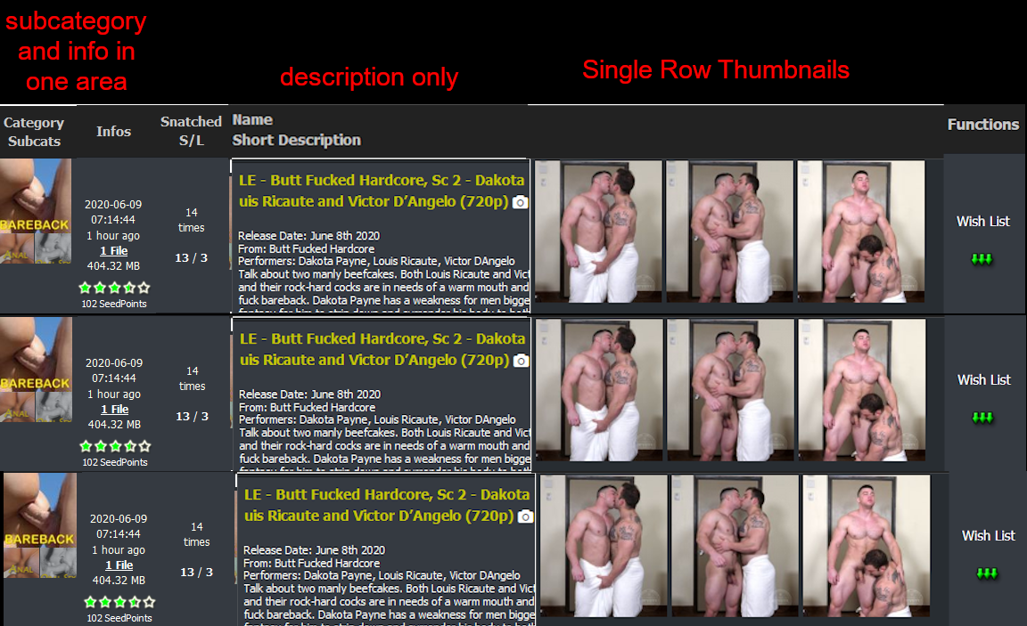
I just did a quick sloppy mock up of what could be improved from the current design.
-
Put Info/Snatched columns on the left, next to subcategory thumbnail column
-
Name/Description column right after. Text only.
-
Thumbnail column that displays only a SINGLE row of images.
You can still make it responsive. The first three columns (Category, Info, Description) will always be present and the amount of thumbnails shown would be relative to the width of the user's browser.
Additionally, maybe the user can also choose to disable/enable the thumbnail column should they only want text in their search results - so disabling thumbnail column means the description column would expand. Could save on bandwidth for both the site and the user and because it is responsive, the height of each line is also smaller allowing the page to display more results
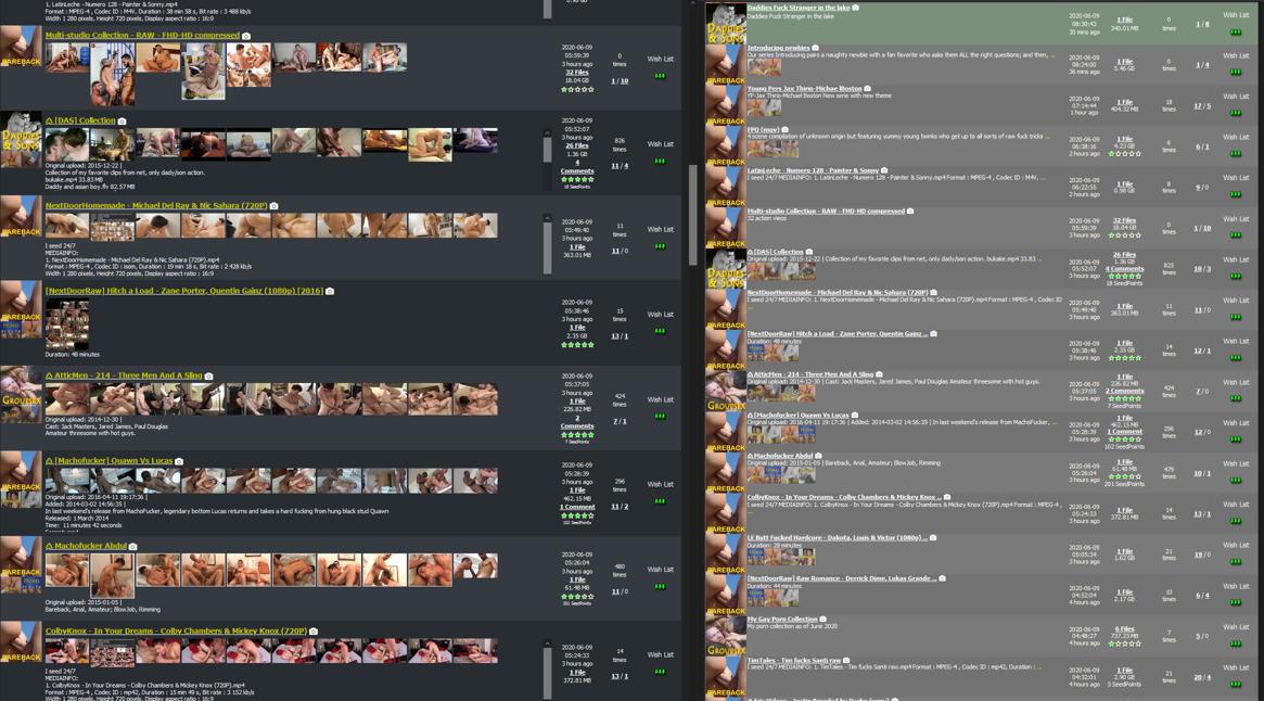
Vertical space is also precious real estate and I think being able to display as much results in one page makes more sense (especially for something that is a search function). A comparison of the new design where you can see 8 results and the old one where you can see around 17 results (both sites are zoomed in the same).
I would even say if possible, i would omit the thumbnails for subcategories (because it forces a minimum row height) and instead just use Colored, styled text.
I do like the new color scheme. Improvement from the previous one. you're definitely on the right track, though and I think the new redesign definitely has good potential with some tweaks.


