New Design
-
I never used to like a redesign, as someone earlier stated, "if it ain't broke, don't fix it". However, when it makes sense to cater to other audiences ie: mobile users, then go for it.
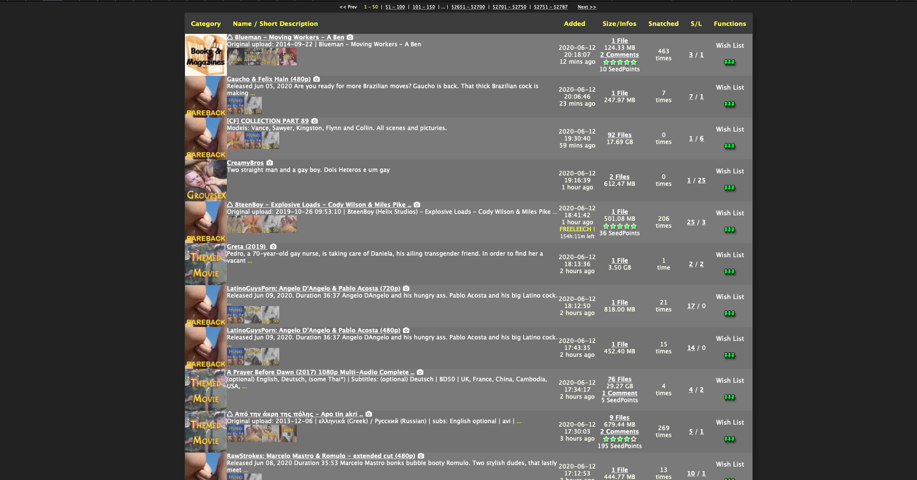
I am quite pleased with the new layout. It looks awesome. I cannot review the mobile website as I had never used it on my phone prior to this major update. I am noticing that the thumbnails for the torrents are overlapping when you click into a torrent to download. I can provide a picture if you would like. I am using the latest Chrome browser v81.0.4044.96 on Andriod.
But thanks for all your hard work. It looks incredible!
-
Hey,
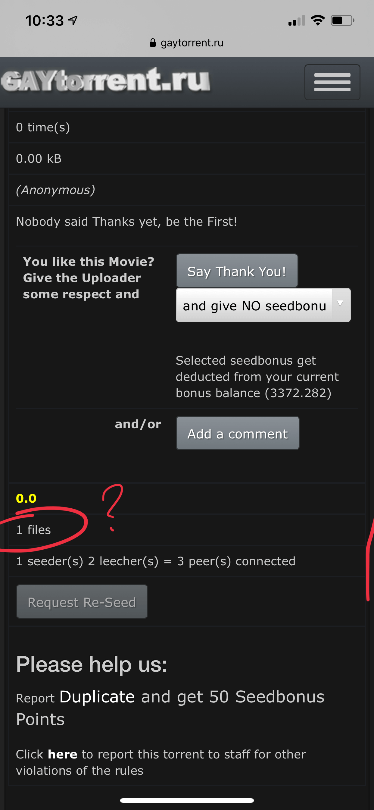
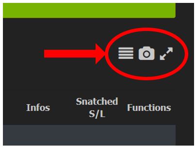
Perhaps I’m missing some setting or something, but for mobile, there’s no first column of the table in single torrent’s view, thus making it impossible to view file list (see images attached).
-
Just wanted to say thanks for all your work on the changes and the site in general.
I do tend to prefer the compressed view more but I'm fine with whatever the majority requests.
I like having the SEARCH button readily available. -
i prefer the old design, you say the new design is cleaner but it really isn't. it's far to cluttered and no need for the descriptions on the front screen, just gets in the way when scrolling with the mouse
-
you lost all user functionality because you take ten times longer to find anything . but it looks better. ugh .as a designer i know most people like it when things look pretty. but if it doesnt work ? at all?
-
I like the three new toggles on the right side of the Search page that allows some customization of the Search view. A definite step in the right direction!
I strongly agree…this way people can tailor to the view they like.
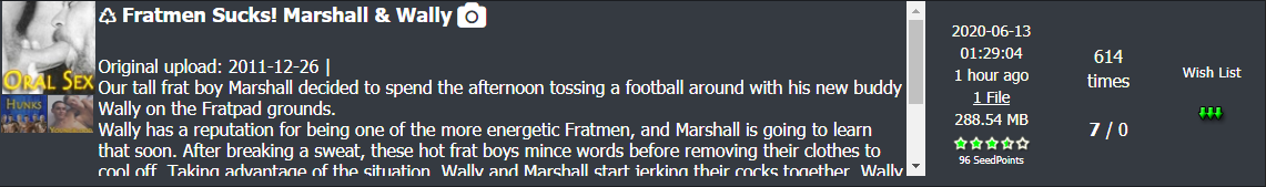
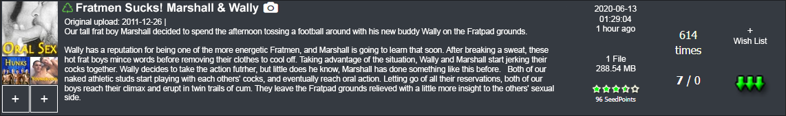
Here's another comment: In the new style, we seem to have fallen victim to the web trend of "bigger font is better." But this can make the titles of the torrents rather harsh to eye. The new titles in (which appear to be Verdana Bold) stand out harshly from the background. Dialling back the font colour just a bit, while retaining the font and size, would be easier on the eye. See the image below: The top frame is the current site design, with the lower frame at a slightly darker grey (RGB:225,225,225 to prove that I'm a nerd). Just a thought.
-
Layout is somewhat nicer.. but very cluttered. On my laptop it uses WAY too much of the screen… I prefer the old one.. sorry!
-
I like the new layout. One thing I miss, however, is the Wish List button in the search view while on a mobile device. I often look through the list of torrents and add those I’m interested to my wish list, for closer inspection or downloading on my computer. It’s great having easier access to the descriptions and images but I still have to open a page for each torrent to add them to my list. Any way to add that button to the mobile search results view?
-
To be honest, I find the new search page way too cluttered compared to the old one, especially because of the thumbnail pictures (that show anyway when you hover over the title). The side scroll bar also makes scrolling down the full search page more difficult.
As a general rule, I far prefer sites with cleaner layouts and more blank space.
That said, you can never please everyone. Maybe we'll all get used to it in time!
-
I like it, the only issue I've noticed is on the search pages, when hovering over the title of the torrent to get the picture preview popup, the top of the first image is hidden underneath the new page header.
any updates about this issue? still having this problem
other than this, i still prefer search (old) -
I like the older design better because it loads a lot faster and with less stuff to scroll through
-
sorry but the new layout drives me crazy
 why fix what's not broken?
In Safari it seems now everything is so big and a lot of space wasted, scrolling through the page now seems forever; I quite like the old design - compact and easy for the eyes. See the screenshots - this is how the new layout looks on my screen compared to the old one.
-
I actually like this one better. It's nice to be able to see the description without actually having to click them. Saves time :cheers:
-
I was not a fan of the new layout with all the thumbnails and other stuff on the screen…but once I learned how to tailor the display to my liking using the three little toggle buttons on the right of the screen (see image below), I can now make the display the way I like it...and I think it's better than before. My thanks to the designers for including these.
I would urge other Gentle Users to fiddle with these buttons and see what they can do for you. You might find the results pleasing.
-
Overall I like the new layout very much! It's such much neater and the little thumbnails are really fantastic. Everything looks much smoother and in general much better. Great work!
My only suggestion would be a slight tweak to the previews that appear when you mouseover the titles. They almost always pop up a preview upwards, which is hard to see in its entirety. If they popped up downwards instead, they would be much easier to see and more helpful.
-
The Search Page is getting much better and I loved the icons that show / hide the images and descriptions but there are some things that need to be improved:
- Reduce the font size used in the name of the torrents and the name must be displayed only on a single line;
- The distance between the torrent name and the description could be reduced;
- Reduce the font size used in the description and, if possible, leave the text "justified" for better alignment;
- The color of the hyperlinks must be changed, it is black and with the new background color, it is very difficult to visualize;
- The images of the categories should be better aligned and, if possible, display the complete image (the small images are cut);
- When an icon is activated to show/hide images and descriptions, I think it should be a different color indicating whether or not it is activated (White/Green);
- The symbol ♺ could be a different color, perhaps green, to stand out among the file title;
- I realize that the space that each torrent occupies is very large, and when the information is hidden, it ends up having a lot of space without anything, I would like a more compact listing when the description and images are hidden.
Attached is a preview of how it is and how it could look.
PS: I couldn't align the description text in photoshop so I got as close to the justified as I could.
-
It looks very nice so far, totally dig it.
-
I like the new layout but one thing im not a fan of under "Search (new)" is it seems a little cramped. I like the old hover over to see more pics vs show thumbs to keep load times down. Nothing major just my opinion. For now i'll keep using Search (old).
-
I switched back to the old design last week after seeing all of the problems with the new design. I posted my complaints and changed back today to see the progress. Some of the problems have been addressed, which is good. :clap2:
But it seems like the new design has become far less efficient.
I can only fit 4 or 5 torrents on the screen at once now, whereas with the old design I could fit 11. That means double the amount of scrolling, so I don't see how this larger design is an improvement. Toggling the descriptions is a nice addition, but the torrents don't get smaller when the descriptions are off. It just cleans up some of the clutter.
Can you make the fonts and the spacing smaller so it's actually using all of the space available?
-
Thanks for making the "old version" of the search page easily accessible.
As I believe I said before, I find the new design of the search page off-putting. Too much clutter of information, making it hard to focus in on what's important. Each time I have tried it, it just frustrates me and gives me headache - so I give up.
Everything else in the new design seems fine (thank you for all the effort and care), but I would not recommend moving ahead with the new search page design
Hello! It looks like you're interested in this conversation, but you don't have an account yet.
Getting fed up of having to scroll through the same posts each visit? When you register for an account, you'll always come back to exactly where you were before, and choose to be notified of new replies (either via email, or push notification). You'll also be able to save bookmarks and upvote posts to show your appreciation to other community members.
With your input, this post could be even better 💗
Register Login