New Design
-
I switched back to the old design last week after seeing all of the problems with the new design. I posted my complaints and changed back today to see the progress. Some of the problems have been addressed, which is good. :clap2:
But it seems like the new design has become far less efficient.
I can only fit 4 or 5 torrents on the screen at once now, whereas with the old design I could fit 11. That means double the amount of scrolling, so I don't see how this larger design is an improvement. Toggling the descriptions is a nice addition, but the torrents don't get smaller when the descriptions are off. It just cleans up some of the clutter.
Can you make the fonts and the spacing smaller so it's actually using all of the space available?
-
Thanks for making the "old version" of the search page easily accessible.
As I believe I said before, I find the new design of the search page off-putting. Too much clutter of information, making it hard to focus in on what's important. Each time I have tried it, it just frustrates me and gives me headache - so I give up.
Everything else in the new design seems fine (thank you for all the effort and care), but I would not recommend moving ahead with the new search page design
-
I like the older design better because it loads a lot faster and with less stuff to scroll through
sorry but the new layout drives me crazy
 why fix what's not broken?
In Safari it seems now everything is so big and a lot of space wasted, scrolling through the page now seems forever; I quite like the old design - compact and easy for the eyes. See the screenshots - this is how the new layout looks on my screen compared to the old one.let me finish first before you go crazy… :cool2:
I was not a fan of the new layout with all the thumbnails and other stuff on the screen…but once I learned how to tailor the display to my liking using the three little toggle buttons on the right of the screen (see image below), I can now make the display the way I like it...and I think it's better than before. My thanks to the designers for including these.
I would urge other Gentle Users to fiddle with these buttons and see what they can do for you. You might find the results pleasing.
that is the point!! Finally you will have ALL those views in one and you will be able to configure it how it works best for you.
Thanks for making the "old version" of the search page easily accessible.
As I believe I said before, I find the new design of the search page off-putting. Too much clutter of information, making it hard to focus in on what's important. Each time I have tried it, it just frustrates me and gives me headache - so I give up.
Everything else in the new design seems fine (thank you for all the effort and care), but I would not recommend moving ahead with the new search page design
if i would give up this quick and listen to people with no visions, this site would not be available today at all
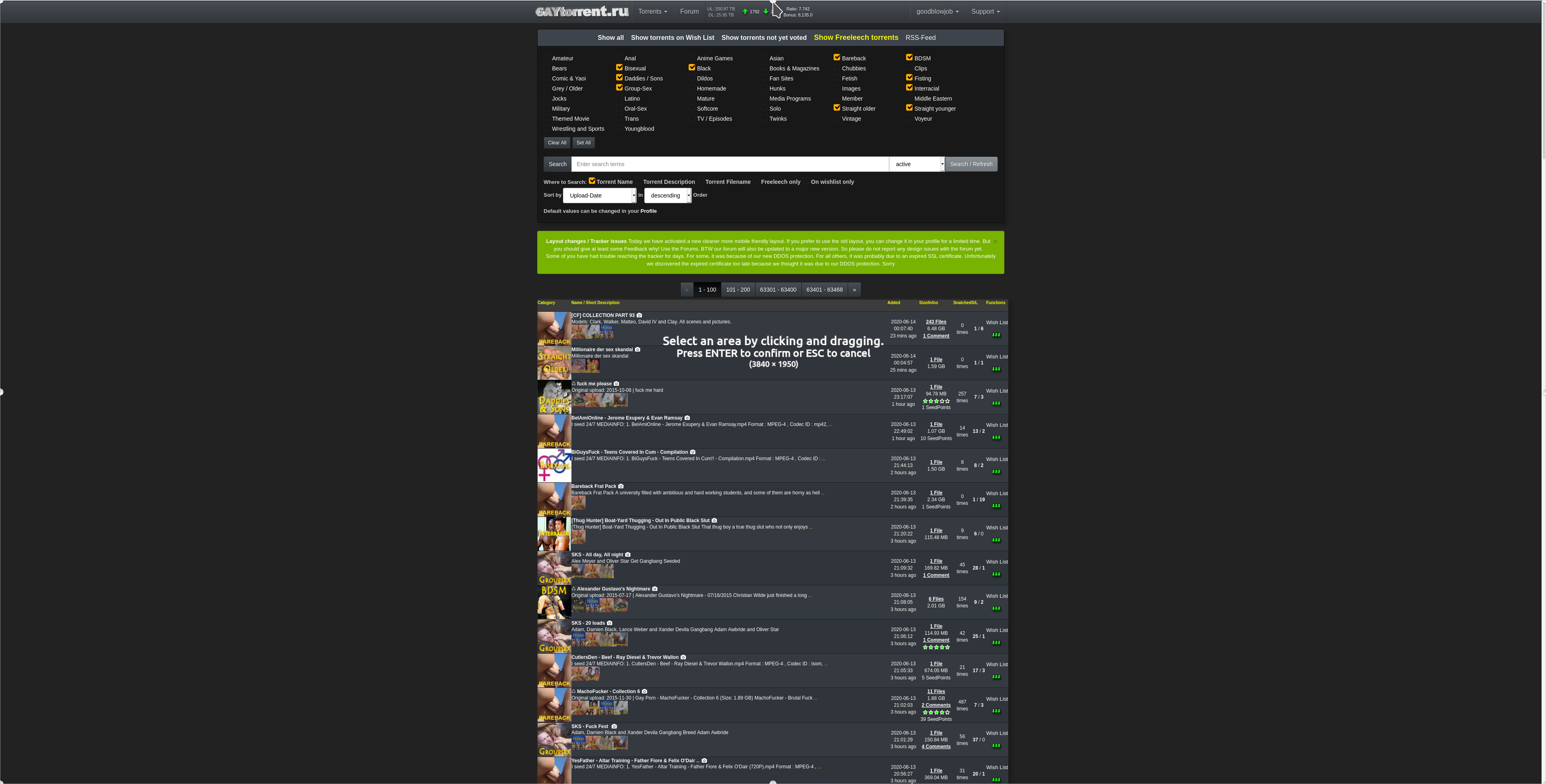
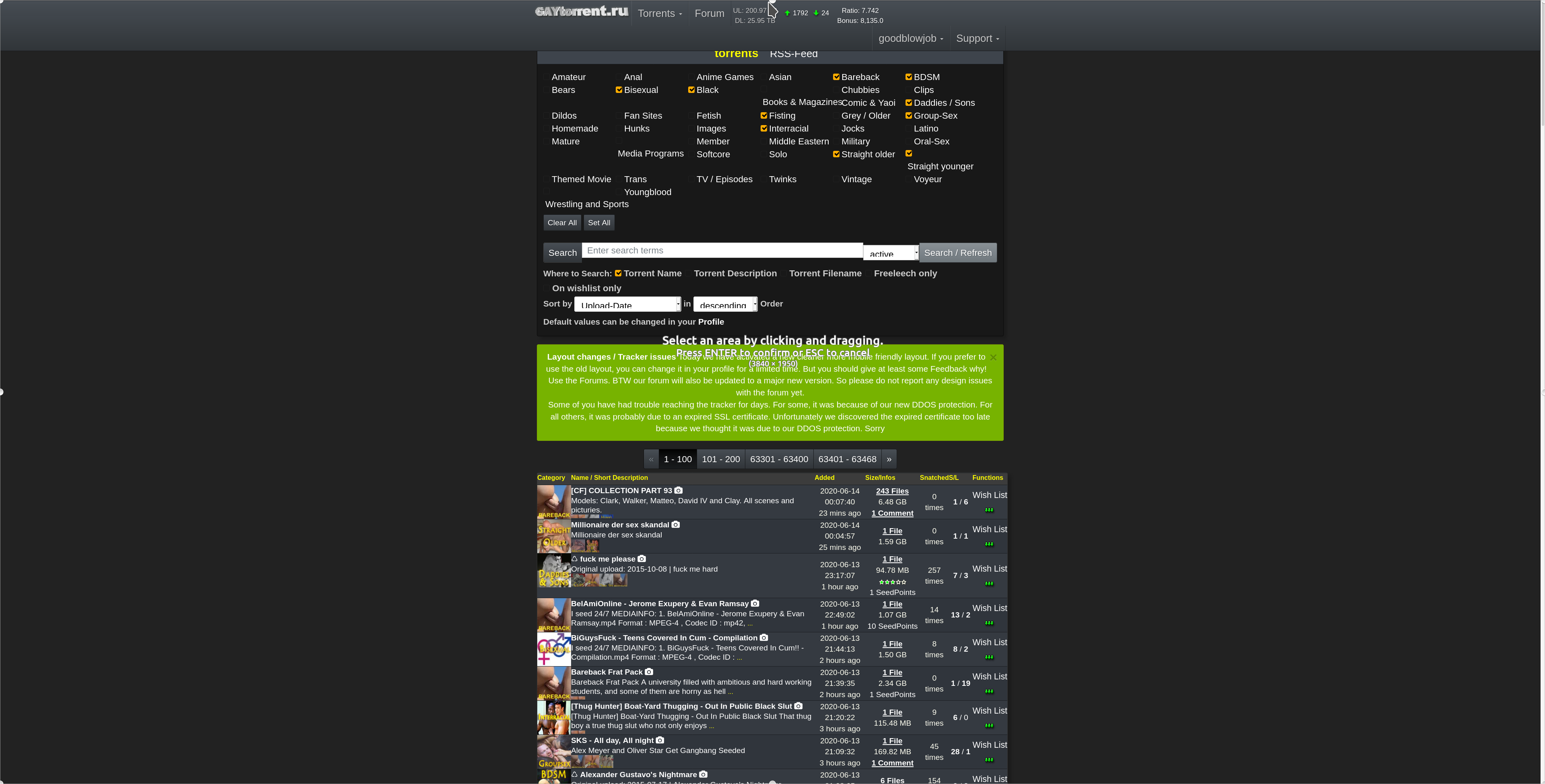
The Search Page is getting much better and I loved the icons that show / hide the images and descriptions but there are some things that need to be improved:
- Reduce the font size used in the name of the torrents and the name must be displayed only on a single line;
- The distance between the torrent name and the description could be reduced;
- Reduce the font size used in the description and, if possible, leave the text "justified" for better alignment;
- The color of the hyperlinks must be changed, it is black and with the new background color, it is very difficult to visualize;
- The images of the categories should be better aligned and, if possible, display the complete image (the small images are cut);
- When an icon is activated to show/hide images and descriptions, I think it should be a different color indicating whether or not it is activated (White/Green);
- The symbol ♺ could be a different color, perhaps green, to stand out among the file title;
- I realize that the space that each torrent occupies is very large, and when the information is hidden, it ends up having a lot of space without anything, I would like a more compact listing when the description and images are hidden.
Attached is a preview of how it is and how it could look.
PS: I couldn't align the description text in photoshop so I got as close to the justified as I could.
And finally comments like that show me, that some of you already get the vision BEFORE everybody starts clapping at the end. Im sure almost all of you will!
thanks for this.. yeah.. the font sizes are now little to big.. i tweak it again in my next update. hyperlink colors already change now.
expect an update by tomorrow
-
Chrome user.
- I like the darker theme. The forum page numbers on the bottom left are difficult to read .middletext (I didn't realize this thread had 10+ pages until I swapped theme back) Edit: And the 'post preview' .post is also black on grey there (missing .windowbg's white).
- The hover-thumbnail-preview going off the top of the screen was annoying enough to swap to "top right mode", having a selection of first thumbnails is pretty good and getting used to.
- Preview of description is solid choice. I'd prefer the previous title and description size but a mild bit of zoom out fixes that. Really dont like that the description scrolls only as it occupys a lot of the screen and it captures the mouse scroll to the frame and in some cases you cannot scroll the page at all ever. Id suggest no-scroll, potentially with click-expand.
- Is there a rash of "original upload" reuploads? I thought that kinda thing wasn't allowed? Is there a way to search for a NOT with a dash, or have an option to exclude previously uploaded things, maybe a 'reseeding' category?

- Infos - far too much. Suggestion - just '10 hours ago' and the other date data in the hover. Same for Freeleech/time. Size of DL and the number of files (and put it the DL stats column?). I'd suggest using a simpler looking 'direct download' icon tho! (+Wishlist
 Download)
 - The hover over file stays up for a loong time. It must have different vanish code than other popups.
hope it helps!
-
Thanks for the effort you put into this. For me at least, the overall feel is very jumbled. It's hard to tell where each new entry is. They all run together. And when you add the scrolling effect within each main window, it gets a little dizzying. Maybe add a little blank space between each entry?
-
Some more icons I made
could you please contribute your icons here: https://forum.gaytorrent.ru/index.php?topic=66791.0
i really like them so far..
-
Honestly I would take anything dark as long as it's not a white background. the thumbnails are amazing! scrolling now is very easy and faster when you're seeing everything in front of you without clicking on every torrent to see the details. I used to miss good torrents that I didn't notice because their title wasn't interesting enough, but now you can't miss anything uploaded.
-
I think the old design is a lot cleaner and practical. Having scroll bars in some torrents with long descriptions is very awkward and in general seems like the list ítems in the search are very bulky which makes you scroll down a long long page to see the same amount of results as before. Also, the Font is too big for my taste, just an opinion.
The Torrent detail pages seem alright, I don't know if there was a change there, however the search page is not very practical.
Hope this helps.
-
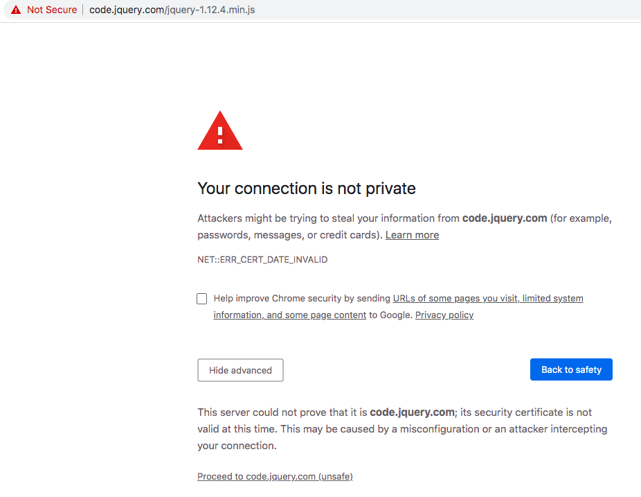
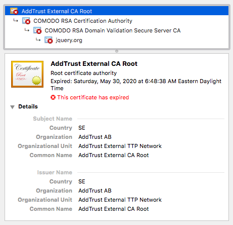
I have use a browser extension that blocks web content from third parties and I highly dislike having to whitelist (It's just this item https://code.jquery.com/jquery-1.12.4.min.js) for this website now to use the menus and show the thumbnails. The old design didn't make me do this. Please make the old design permanently accessible.
-
Hi,
I like the new look very much, but I switched back to the old layout because there is no switch to logout. -
Hi,
I like the new look very much, but I switched back to the old layout because there is no switch to logout.The logout link is the last item in the dropdown menu accessed from your user name at the top of the page. It might be more obvious if it were above the stats section instead of below it.
-
The new design is great on mobile. On my 4K desktop it's a bit too small. When I use the browser zoom function it gets very jumbled. If it could handle zooming better it would be perfect! Screenshots attached.
-
Seems
Seems quite similar to me. Presents quite cleanly on the mobile phone though.
1. Are you reactivating the bonus facility ? I need to use it .
2. I really need you to implement a 'select all' option on messages . I'm fed up of having to delete each message one by one and wait for the page to reload after each delete. Not cool.
3. But I here you've been waiting a while to re-jig the site so hopefully lockdown will give you time to address some changes…..
Cheers
Twzz
-
I have use a browser extension that blocks web content from third parties and I highly dislike having to whitelist (It's just this item https://code.jquery.com/jquery-1.12.4.min.js) for this website now to use the menus and show the thumbnails. The old design didn't make me do this. Please make the old design permanently accessible.
I'm using Chrome (current version) which indicates the SSL certificate from jquery.com has expired and may not be secure. So, none of the dropdown menus for Torrents/User/Support are working because jquery-1.12.4.min.js is prevented from loading.
Looks pretty good otherwise. The only thing I would recommend is to add some padding (on the right) between the Categories and the Torrent Name/ Description columns as well as some padding (top and bottom) between each torrent. I think that might help make it easier to skim when browsing the latest torrents.
-
I would appreciate your feedback on today's design update. Some of you have already reported about fonts that are too small. It is always very important to know where exactly on which page you see a problem. Then we save ourselves unnecessary questions back and forth. Of course I am also happy about every positive feedback, without any change wishes. :cheers:
I love the new design but I don't like preview pictures opening in the same window when selecting from a torrents page. Large previews are compressed to fit the page instead of opening in original size in a new window. Can you add an option for this to be like the old preview setting?
-
I have use a browser extension that blocks web content from third parties and I highly dislike having to whitelist (It's just this item https://code.jquery.com/jquery-1.12.4.min.js) for this website now to use the menus and show the thumbnails. The old design didn't make me do this. Please make the old design permanently accessible.
Sorry guys… forgot to put the file local on live mode....
Can some Android user check the torrent details page for me? are the thumbnails correctly displayed now OR are they still overlapping? On IOS this works fine.The new design is great on mobile. On my 4K desktop it's a bit too small. When I use the browser zoom function it gets very jumbled. If it could handle zooming better it would be perfect! Screenshots attached.
thanks, for your screenshot. This really help me fixing this !
Seems
Seems quite similar to me. Presents quite cleanly on the mobile phone though.
1. Are you reactivating the bonus facility ? I need to use it .
2. I really need you to implement a 'select all' option on messages . I'm fed up of having to delete each message one by one and wait for the page to reload after each delete. Not cool.
3. But I here you've been waiting a while to re-jig the site so hopefully lockdown will give you time to address some changes…..
Cheers
Twzz1. bonus fcility? what are you talkin about? i did not deactivate anything. maybe it is just not visible for you (your screen size) not sure
2. you are talking about our pm inbox/outbox system right? It might get some nices updates as well. But first things first: Everything about the torrents…
3. I stop when it's done. Regardless of Corona.
I love the new design but I don't like preview pictures opening in the same window when selecting from a torrents page. Large previews are compressed to fit the page instead of opening in original size in a new window. Can you add an option for this to be like the old preview setting?
How about just using the zoom feature in the viewer ? Btw still can do just right-click->open in a new tab on those pictures you really like to see in a seperate Tab
-
I do too, shame it's gone soon, just love it, but I am on a desktop, so I guess for mobile users, the new might be better, but are mobile downloads more than desktop/notebook downloads? Why change something that's so good, for something that looks way less? But of course you put so much wrk in it, I better not complain. The site has always been amazing!!!!!!!
-
Full honesty? It was better than way it was. Now the site is bug on mobile and even when put on PC mode the pictures on torrent page are off. Thank God when searching something there's no bug.
-
I like the new layout but what i don't care for is on the browse screen when someone attaches a long picture it all shows up and you have to scroll a bunch to get past it, also can't see the info easily
-
This is what I get on a Samsung Galaxy A50 running Google Chrome and Android 10.
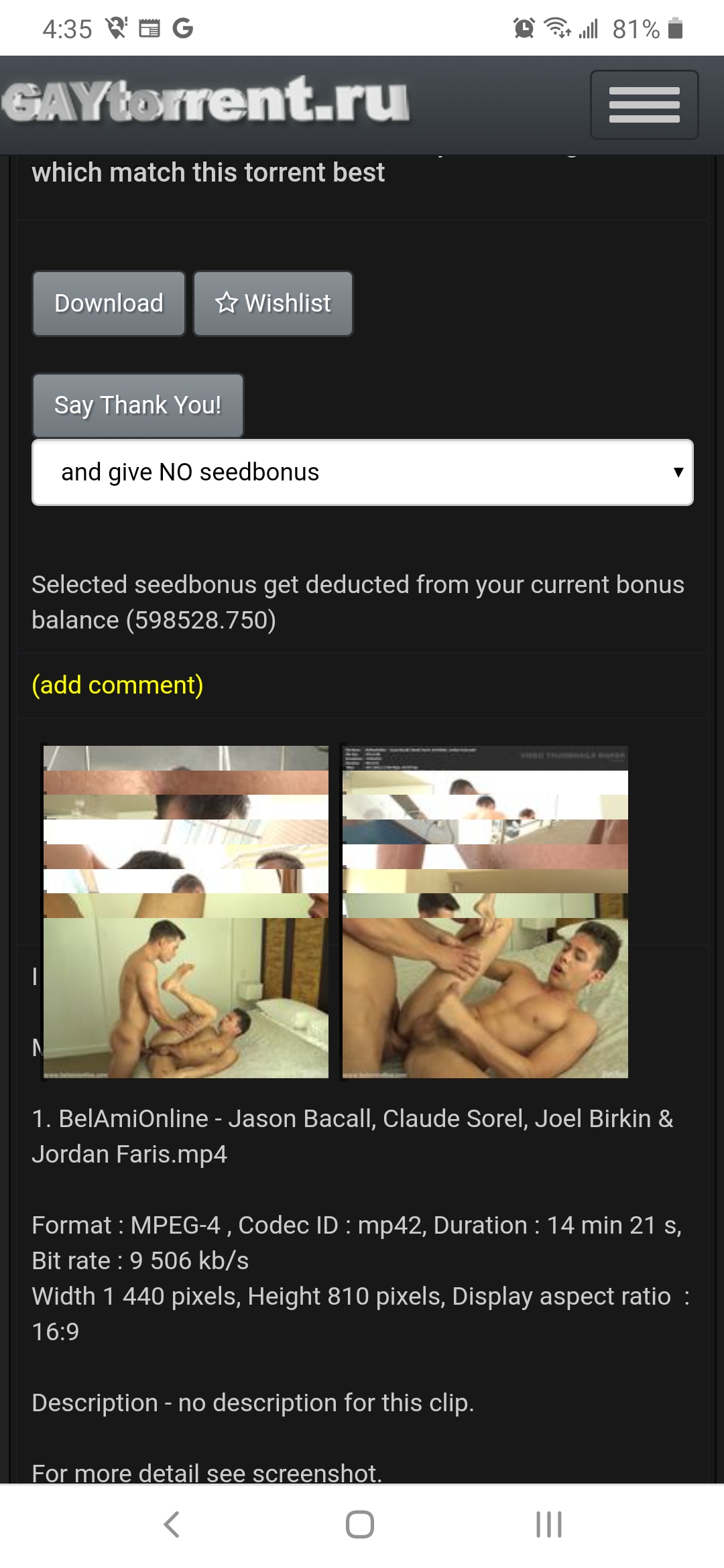
It does the same thing on my Alcatel tablet, but interestingly, on my tablet, when I rotate the screen 90° then rotate it back, the pictures don't overlap anymore.
Hello! It looks like you're interested in this conversation, but you don't have an account yet.
Getting fed up of having to scroll through the same posts each visit? When you register for an account, you'll always come back to exactly where you were before, and choose to be notified of new replies (either via email, or push notification). You'll also be able to save bookmarks and upvote posts to show your appreciation to other community members.
With your input, this post could be even better 💗
Register Login