@sendmelies:
I have two problems with the new design and both are about usability.
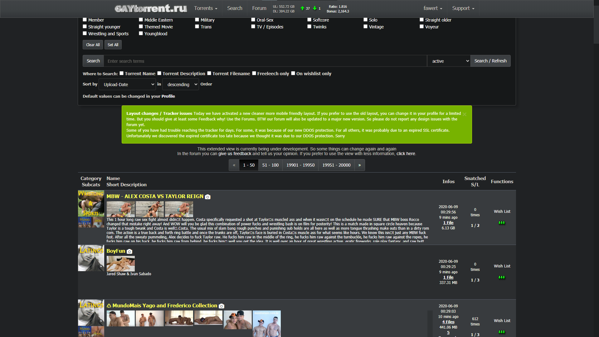
1. Showing pictures on search by default makes it more difficult to navigate, and not easier. There's too much information on screen, I'm bombarded with thumbnails of torrents I'm not necessarily interested in until I get to find the ones I want to see. 2. Then the new way to zoom in the images to check more than the thumbnails is not intuitive. In the end I get to see less of what I want and way more of what I don't care about.
Not everyone uses browse as primary way to find their files.
I like the new fonts, but about the new color scheme at first I thought somebody had died and the site was mourning…
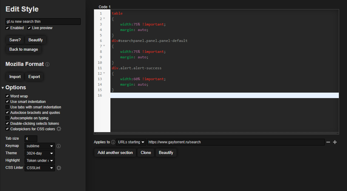
I for one like having pictures in search. Looks a bit cluttered atm but there is potential for it to look better (limiting number of visible photos, uniform sizing, better placement…). Still wish the search is less wide though.
Also when you scroll if there is an entry with super long description you have to scroll though the whole thing before it continue to scroll down the page. Please limit the description length to fit the container height and put ... at the end.

