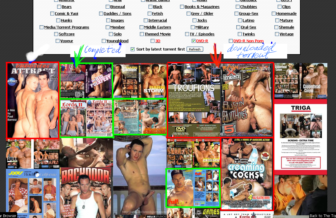
The New Picture Browser - Feedback
-
In the Picture browser category box, It is nice that , In my case, all 12 of my favorite categories are automatically checked.
But could you add a Clear button? E.G, sometimes I just want to look at 1 category, But I have to UNCHECK the 11 others.. ThanksWell, I did notice that if you just double click the "NAME" of one catagory the rest will clear. But many might not know that.. Just a thought..
-
:afr: I realize that only know as you pointed the double click function on a category name. As moderator, usually I've no category selected, means all.
"Clear all" and "Select all" like added on the search should be more intuitive.
-
Do not like the new browser
-
Your comment would be more helpful if you would explain why you don't like it ….
-
can we get a free leech only tick box on the picture browser? thx!
edit: btw love the pic browser
-
I hate the new picture browser.
-
Your comment would be more helpful if you would explain why you don't like it ….
-
Don't get me wrong it's very nice feature, but …
its remind me of Windows 8 Metro UI
p.s.
i would add some bars :
red downloaded torrent
green completed file
-
@mirko69: i do not know windows 8 yet.. i jumped to osx in 2008 :cheesy2:
so many cool ideas - can't wait to find some time to implement some of those.
I was talking to popper already about colored borders arround those pics for torrent seperatioin: eg: white border, next torrent grey border, than again white border and so on.
thx to you we also change the colors for downloaded torrent AND completed (snatched) :crazy2:
Also i do not forget those other ideas posted earlier. I gonna get back to you guys soon (with an update) !
-
The new picture browser is an interesting option. I'm glad the search feature is still available. I know that many guys base their downloads mainly by the photos, but I like to see the stats - file size, comments, and description - at the same time as the photos. I :love: gaytorrent!
-
I tried the new picture browser again today, and I see there have been some slight changes (since the last time I used it) that made it more comfortable; in particular, the pop-up of the title and description seems to work better now, and makes it much better for looking over what's new than it was when I first tried it.
I have a number of new comments.
(1) when people create a new torrent, it would be nice if you provided some mechanism whereby they can exercise more precise control over which of several images will be used to illustrate the torrent as a pop-up in new picture browser, and which will be used to illustrate the torrent on the older search page. At the moment, as far as I can make out, the first image to be uploaded to a new torrent announcement is the one used as a popup on the old search page, and the last image to be uploaded appears in the new picture-browse and on the page of the torrent itself (before you expand or leaf through the other images). I think you should allow the uploader to select his exemplary figures for these two purposes.
(2) I think that, as a result of this change, something about the "comments" popups on the old search page was damaged. I used to get a popup of user comments when I selected the comments link on the search page. Now, I get an hourglass and nothing happens. Very occasionally, if I then move my mouse cursor, I get the briefest view of a popup which should have appeared, which vanishes again before anything can be read. I imagine that this will behave differently in different browsers, but that's a sign that something isn't as it should be. Something got broken along the way, here.
(3) I still think you should add a control to the main page of a torrent that allows that torrent to be added to the "wish list"–this feature is only available at the moment on the old search page, and so users who prefer to use the new picture-browser have no way to mark a torrent for their wish list except to go back to the old search and choose the wish-list control there.
-
In brief:
(1) Something going beyond that proposal is in preparation
(2) That is noticed and reported by many users and will be fixed ASAP
(3) That made it already to the long "to-do list" -
I never post here in the forum, but I had to chime in here to say I LOVE the new picture browser. Especially since we still have the option to use the regular search. COOL

-
…
(2) I think that, as a result of this change, something about the "comments" popups on the old search page was damaged. I used to get a popup of user comments when I selected the comments link on the search page. Now, I get an hourglass and nothing happens. Very occasionally, if I then move my mouse cursor, I get the briefest view of a popup which should have appeared, which vanishes again before anything can be read. I imagine that this will behave differently in different browsers, but that's a sign that something isn't as it should be. Something got broken along the way, here.
...This should have been fixed finally. We, the torrent staff were already crying for it :cheers:
-
(2) should be fixed now
in addition i added a scrollbar on "file list thumb if it extends the maxheight"
the thumbs get layouted with masonry to save some space
tootltips are visible a little bit longer. this enables you to get into the tip with your mouse and click on links inside -
Oh, good! I'll be sure to test it today, and see if I can confirm (as a naive user) that things are working more smoothly!
Thank you!
-
I think it's confusing and prefer it the old way. Not everything can be transported by pictures.
I don't mind as long as the old search is still available though.
-
I love the new picture browser. Please keep it!
-
I like it a lot.
-
We should have the regular torrent browser set as default, and then people can choose to go to picture browser if they want.

