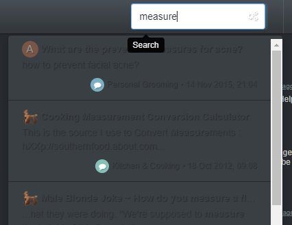
Search Box Results difficult to view. {Solved}
-
Not a bug, but definitely a problem with a default color subchoice. When searching to find a post, results are hard to read.
-
@Joker another one for you.
-
anyone could help fixing those by supplying
.font-xyz {
 color: #123456;
}
fixes.. this would help
")
-
Oh kewl, show me where the CSS files are
")
(He did say anyone.)
-
The colors are similarly problematic for the initial message/chat feature (but it does not pose a problem once engaged or enlarged from the initial setting).
-
@bc22 @raphjd
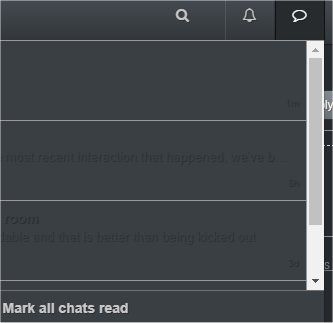
since nobody supplied a fix, i change the colors on my own.. should be readable by now...
just to let you know how this specific change look like:
.chat-list { border:none; border-left:none; border-right:none; border-bottom:none; } .quick-search-container .quick-search-results li a { color: #ffffff; } .header .chat-list, .slideout-menu .chat-list { color: #ffffff; } .header .chat-list>li:not(:last-child), .slideout-menu .chat-list>li:not(:last-child) { border-bottom:none; } .chats-list>li { border-left: none; border-right: none; } -
Oh stupid me, it would have taken no effort to simply suggest a color choice.
If I can attempt to tell a joke, I could have attempted to say #white or #ffffff
Thank you for fixing that, both look great
-
@joker Great Job on this !!!
@ this moment chat font is clearly visible and easier to view matches with the gray background...
Thank You !!!
